Exhibition Review
“The Cartography of the Unseen”
An international exhibition presented at HIT’s Research Gallery, Master’s Program in Integrated Design, Faculty of Design, Israel, February 2015; Curator: Dr. Yael Eylat Van-Essen; Co-researcher and assistant curator: Dr. Sayfan Borghini; Academic director: Dr. Dror K. Levi.
1 This thoughtfully put together exhibition assembles thirteen mapping projects comprising global regions, urban environments, and sites divided almost equally between the southeastern and the northwestern hemispheres. It deals with the problematics of the symbolic power inherent in action of mapping, both from top-down and bottom-up perspectives. The cases represented, all digital initiatives, each demonstrate an alternative visual view that challenges or even undermines the more institutionalized and hegemonic views of the spatio-political order.1 This is achieved with four methods: through a deconstruction, reconstruction, and a critical examination of the official or semi-official versions of “truth”; through a visual reproduction of qualitative interpretations based on quantitative data or first-hand experiences that are otherwise hidden, hastened, or marginalized; through the creation of complex models for de-Eurocentrization of cartographic knowledge; and through an accurate registration of variables, like spatial-behavioural movements or religion, within urban territories, some of which are entangled in deep conflict.
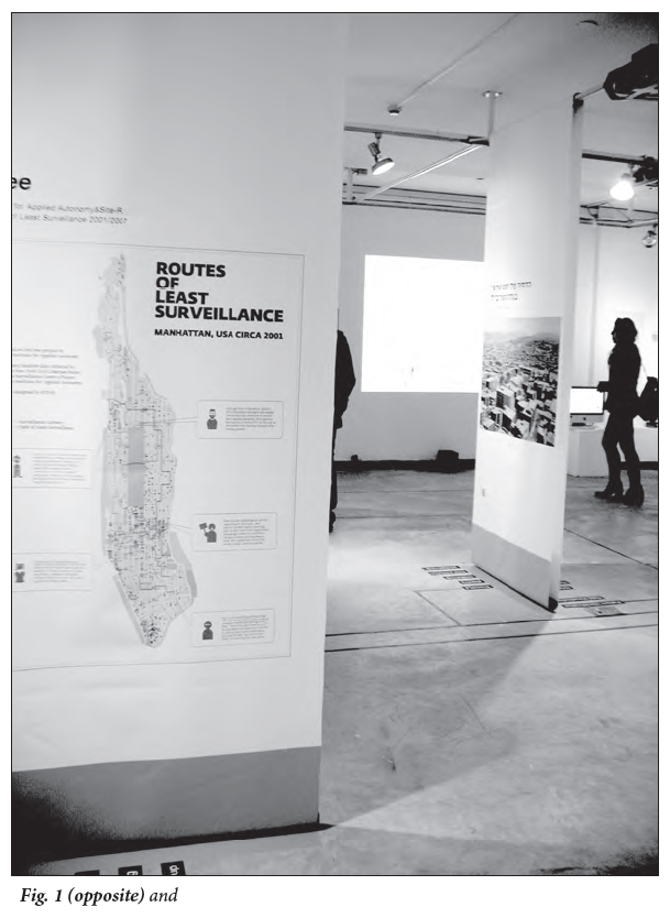
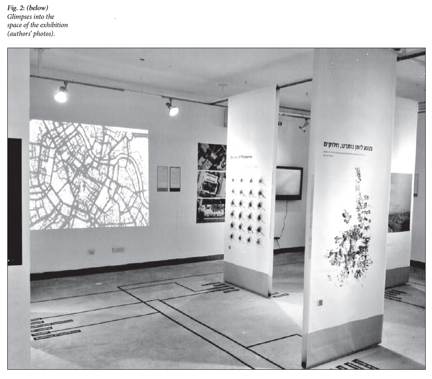
2 The exhibition is both physically and conceptually arranged around a “meta-map”— providing an Archimedean point from which the observer can grasp the comprehensive scope of the thirteen examples selected. Each of these examples constitutes a “sub-map,” and most of them include a brief film, accompanied by a short analysis and some further visual material. The arrangement of these projects within the space of the gallery is non-linear, enabling a contextual discourse amongst them. The discursive quality is also contrived by adding internal screens and using the floor to plant a “legend” of relevant keywords in respective colours, in conformity with the actual semiotic process of cartographic reading (see Figs. 1, 2).
3 One of the most prominent impressions left by this exhibition is the strong, somewhat revolutionary, transnational leitmotif that is embedded in the thirteen projects. From Calcutta to New York, from Geneva to Baghdad, and from Nairobi to Palestine—counter-strategies of mapping are brought from the background to the forefront of attention, casting new light on their immense political relevance. In fact, tracing these acts of mapping, and the visual representation they engender, in an era of Big Data reveals unexpected channels of flow between “people, ideas, products, processes and patterns that operate over, across, through, beyond, above, under, or in-between polities and societies.”2 The common political links between the cases that are juxtaposed in this exhibition are salient, due to several techniques of visual configuration used by either the architects of the mapping projects themselves or by the curator-in-chief of the exhibit. An expert in digital culture, in its theorization within the arts, and in museology, the curator’s sensitivity to cartographic apparatuses that hide/reveal moral, ideological and political issues is remarkable.3 Her more nuanced views are expressed, inter alia, in her answers to the two following questions (Liora Bigon, personal communication, February 24, 2015):
4 In fact, all of these issues are skillfully mirrored in the very title of the exhibition, The Cartography of the Unseen, which implies the seemingly internal contradiction it aims to treat. In other words, if the unseen can be accurately measured, and thus can be turned into seen, its erstwhile “unseeness” might therefore be a mere perceptual construct. But then, the inevitable questions arise: What exactly is this unseeness that has been constructed? By whom has it been constructed? Expanding on one of the projects presented—taken as an allegory for the overall message presented by this exhibition—might be the best way to exemplify these questions.
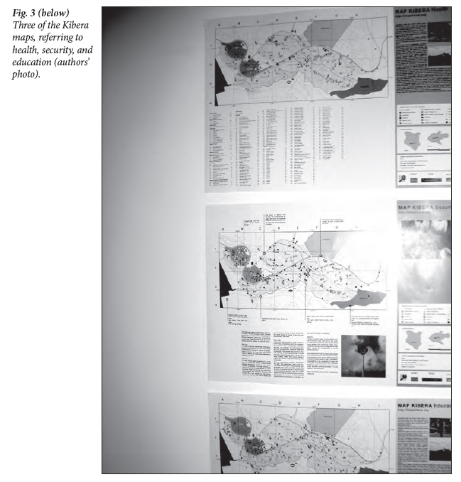 Display large image of Figure 3
5 Based in Kibera, an unauthorized settlement in Nairobi, and one of the world’s most renowned slum areas, the non-governmental Map Kibera Trust has a mission, “to increase influence and representation of marginalized communities through the creative use of digital tools for action.”4 Until 2009, this area appeared on the maps as a blank spot, or rather, formally considered a “forest” area. 5 The first digital map of Kibera was created by empowering youth volunteer residents and providing them with technology and new-media tools such as GIS, SMS, and video. In fact, a series of maps were produced through this process of consultation, slicing the area according to relevant informative themes for autochthonous life. Some of these mapping themes, e.g., health and education facilities and security issues, are reproduced in the exhibition. (Fig. 3) In addition, journalism platforms such as blogging were constructed as well, in order to promote community participation, digital storytelling, and information sharing; targeting both local and international audiences. Map murals throughout Kibera are also an important part of this endeavor, and, following the success of the project, it became a model for similar mapping action in other slum areas in the city, such as Mathare and Mukuru.
6 The idealistic Lefebvrian mission of the trust: to ensure an equal right to the city for all its residents and their inclusion in public policy, coincides with a much more practical aim: to use the information produced in order to bridge between the slum residents and some key agents. In the regional arena, these include chiefs, elders, city council officials, other NGO representatives, local administration, the private sector, and legal institutions. This aim is important in trying to blur Foucauldian administrative mechanisms that are intentionally and institutionally well designed to work against Kibera’s people.6 Indeed, planning of informal settlements in sub-Saharan Africa’s cities has been given precedence in recent years, including the establishment of communities of practice when planning education7 —but it is not the “southward turn” in planning theory that I would like to adopt/discuss here.
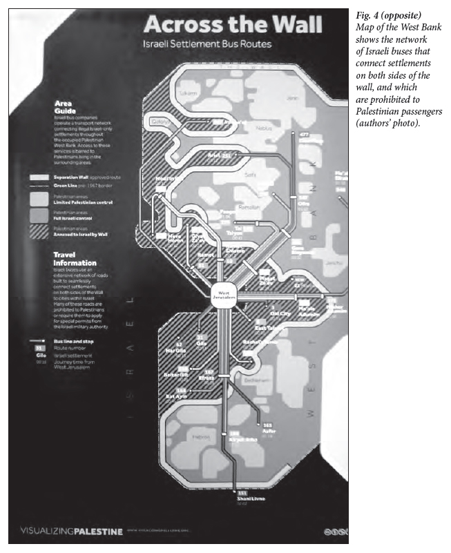 Display large image of Figure 4
7 The exhibition, in which a variety of mapping practices are meaningfully examined, highlights the materiality of the unseen in both the global East and the global South. This point is important in showing the multiplicity of places and contexts in which the unseen, or the Other, has been constructed so far. No less important is that by measuring, quantifying and visualizing the data, the collection of the thirteen projects has directly engaged in turning the unseen into seen, and by this the seen is fully legitimized.
8 The exhibition is about the blurring of hierarchies. It is about questioning the power that is held over representation, held so far by the city authorities of New York, Calcutta, Nairobi, and Jerusalem, the Israeli government (Fig. 4) and the Austrian government. By giving precedence to mapping processes “from below” and to a full representation of the erstwhile unseen, it calls for a reorientation. Even if the projects presented cannot directly change the prevailing political reigns or alter institutionalized imageries, they constitute an effective “punctum” by attracting and holding the viewer’s gaze, by their challenging transnationality, and by their somewhat unexpected and thought-provoking creative quality.8