Research Reports / Rapports de recherche
Industrial Transfers from the Collection of the Canada Science and Technology Museum
1 In December 1974, Ronald A. Davey, the Chairman of the Department of Art and Design at the University of Alberta, wrote a letter to the Canadian Pacific Public Relations Office in an attempt to obtain funding for an acquisition of, in his opinion, an exceptional collection of art works.1 The collection was indeed unlike any other in Canada. It consisted of thousands of industrial lithographic transfers, produced by a British company, Tearne & Sons, at the end of the nineteenth and the beginning of the twentieth century. The collection had a unique historical and educational value. Even though the word "transfer" or its American equivalent "decalcomania" was often used to describe a drawing, design, or pattern that may be moved from one surface to another through direct contact, and the decorative technique itself was well known, both were usually associated with chinaware and pottery decoration. Yet industrial transfers, applied for example to railway stock or commercial vehicles, were not as common and represented the vanishing phase of decorative arts that originated in Victorian extrinsic ornamentation and carried on well into the first decades of the twentieth century. As the styles of the industrial embellishment changed, the role of the artist-craftsman became obsolete, and even as factors such as the range of commercially accessible colours increased, the transfers became a testimony to the past philosophy and technique of decorative arts.
2 The collection that Ronald Davey referred to in his letter was assembled by Roger Silvester, a professor with the Department of Arts at the University of Alberta. Between 1966 and 1967 Silvester worked at the School of Foundation Studies at the Birmingham College of Art in England. In preparation for the course he was offering, Silvester needed to acquire some lithographic stones that he could use as teaching material. He was directed to Tearne & Sons, a Birmingham company that at the time was changing the technology and reorganizing its business. In addition to numerous lithographic stones used to imprint decals, the company still had an extensive number of leftover transfers manufactured decades earlier and never distributed to customers. Unfortunately, these transfers were being melted by Tearnes to recover the gold and silver used in production to enhance the allure and value of the decals. Still, Silvester managed to create enough interest in the British art circles to save the remaining stock. Acting as an agent for Tearne, he directed the sale of transfers to various museums and art galleries around the United Kingdom. He also co-operated with the Arts Council of Great Britain in London and the Welsh Arts Council to organize a travelling exhibit of Tearne's transfers titled "Industrial Devices: An Exhibition of Nineteenth and Twentieth Century Graphic Design and Company Motifs." The exhibit focused on the transfer art as the expression of corporate identity and was met with some positive reviews in British newspapers.
3 For his role in saving and promoting transfers, Silvester was allowed free and unrestricted access to the remaining material in order to assemble his own collection. In the late 1960s, Roger Silvester came to Canada and brought the transfers with him. Silvester intended to divide the collection: a part of it was to be mounted into a permanent display that could be used for teaching purposes; the remaining transfers would form a comprehensive exhibition to tour the countries for which the material was originally produced. However, it soon became apparent that mere preservation of the collection was an issue, and Silvester had to face the inevitability of selling the collection — likely to interested American buyers — in order to stop its rapid deterioration.2 His colleague and friend, Ronald A. Davey, understanding the importance of such a collection to the history of industrial arts, was determined to keep the assemblage in its entirety at the University of Alberta. He felt that the Department of Art and Design, with its blend of disciplines, offered a unique context for preservation and interpretation of industrial transfers. Davey perceived the transfers as an important element of the history of art and design in its broad sense. For him, the collection was a valuable resource allowing for the analyses of printmaking techniques of the late nineteenth century, such as the lithographic process, as well as studies of industrial object design and the early graphic arts.
4 Securing the funds necessary to retain the collection in Canada and particularly at the University of Alberta was not an easy task. British-made transfers did not carry direct significance to Canadian technology and the relevance to Canada was the main criterion applied by government institutions in their allocation of finances to cultural organizations. Moreover, in the case of art acquisitions, the priority was given to other public institutions such as museums. Consequently, every government body approached by Davey, including Secretary General of the National Museums of Canada as well as the Secretary of State, dismissed the request for funding on the same ground: the lack of Canadian context. Since the collection fell between the category of "art" and "technology" it was also unlikely that any art gallery would be interested in acquiring the transfers. The odds of preserving the entire collection in the country were diminishing.
5 Coincidentally, the letter sent by Davey to Canadian Pacific ended up on the desk of CP's Supervisor of Special Projects and Corporate Archives, Omer Lavallée who, having a small, personal collection of railway transfers, supported the idea of retaining such art works in Canada. Realizing that neither Canadian Pacific nor other agencies that offered cultural sponsorship programs would be able to assist in Mr Davey's endeavour, Lavallée took the liberty of discussing the matter with John Corby, then curator of Industrial Technology at the National Museum of Science and Technology in Ottawa, who stated an interest in the collection.3 The dichotomous art/industry character of the collection, which discouraged the interest of art galleries, proved to be an advantage in the context of a technology museum's collection. Furthermore, the "technology" aspect of the transfers was not confined to the lithographic process itself, but also to the usage and provenance of the decals; they were an integral part of industrial artifacts that combined pragmatic and aesthetic functions. As the British exhibit indicated, the transfers also offered an opportunity for assembling an attractive travelling display that showed an artistic side of industry, attractive to the general public.
6 After reviewing the collection in person in February 1975, Mr Corby recommended the acquisition of the decals for the Museum. It was decided that the entire collection would be kept in Ottawa. This allowed for the collection to be preserved under proper environmental conditions while also making it accessible to researchers in Canada. The preliminary appraisal of the value of the collection was based on an earlier inventory prepared for Roger Silvester by contractor Iain Scroggie, in 1973. Scroggie identified and described 118 different items and 2 800 separate pieces. In fact, the collection was much larger than first estimated, and the second inventory, conducted by Davey in February 1975, listed more than 300 separate items and 12 600 pieces. Since the collection was not stored properly, some pieces were damaged or in poor condition and many were stacked together.
7 The Silvester collection is indeed comprehensive. A recent inventory conducted by the Canada Science and Technology Museum revealed 644 original designs and, since in many cases there are several copies of the same image, approximately 11 000 individual decals made by Tearne & Sons between the late 1880s and early 1960s. The decals have been treated by the Museum's conservation specialists, separated and dusted with French chalk to prevent adherence. All transfers have been photographed; the digital images are stored on the Museum's collection database, and on CD-ROMs to facilitate research access.
8 The many duplications in the collection allow for true preservation of one copy, while others may be transferred for display as finished products, or studied for research purposes. For example, the analysis of the paper used to produce a decal can only be performed on the artifact prior to transfer. Once the transfer is mounted on a surface, it is impossible to determine what technique has been used to prepare it. Most of the transfers are in excellent condition, with no damage to the image and colours well-preserved; some decals are still separated with the original tissue paper used by Tearne.
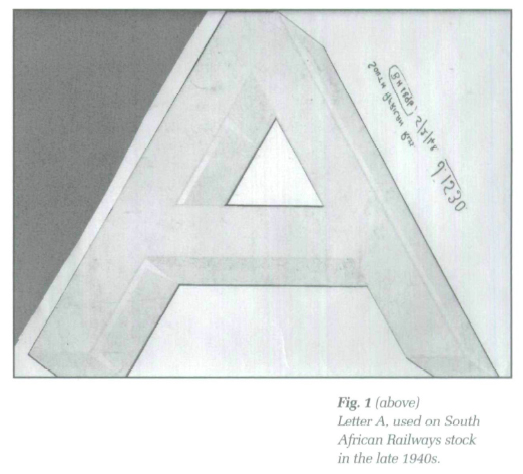
9 The largest part of the collection consists of railway numbering and letters (Figs. 1,2). Tearne produced transfers for many major railway companies in the United Kingdom such as Great Northern Railway, Great Southern Railway, Great Western Railway pig. 3), Festiniog Railways, Liverpool Government Railway, and Cork Electric Tramways and Lighting Co. Tearne also supplied transfers to railways in former colonies and many other countries around the world. The East Indian Railway, Egyptian State Railway, South African (Rhodesia) Railway, Buenos Aires & Pacific Railway, and Ferro-Carril del Uruguay were among many other customers. Transfers were also made for various manufacturers and businesses such as: American Concessions Ltd; Selection Trust; Birmingham Railway Carriage and Wagon Company; Fodens Limited Steam Vehicles; and Marshall, Sons & Co. Britannia Iron Works, to name a few.
10 Although when the collection was transferred to Ottawa, its provenance was established, the history of individual transfers and the technique behind their production was not well documented. In fact, information on transfers is limited to a few magazine articles, general in scope, that focus mostly on tableware decoration. Books on lithography usually devote a page or two to the technique, and the literature on the industrial transfers is almost nonexistent. One notable exception is a monograph by George Dow published in 1973 and entitled Railway Heraldry and Other Insignia. However, this publication emphasizes the artistic description of reproduced images and does not discuss the technology behind their production.
11 The origin of transfer design is not certain. According to the Encyclopedia Britannica, John Sadler and Guy Green — both well-known printers and engravers working in Liverpool, claimed to invent the technique in 1756 to decorate pottery for the famous Josiah Wedgwood. The monochrome transfer technique (a transfer supplemented by hand painting) was used by an unnamed manufacturer at Battersea, London, in the 1750s as an addition to the enamel painting on copper; an image was first engraved and inked onto a copper plate and then imprinted onto a wet paper, which in turn was pressed against a piece of pottery leaving an impression on it. The technique spread from England to Sweden, Germany and France.4 Articles appearing in the Inland Printer in the first decade of the twentieth century suggest that the lithographic transfer probably originated in Germany ca 1851-1852, and was first used to imitate a gold leaf on iron sewing machines, and then was applied to chinaware. In 1856, C. G. Gottgetreau of London was said to patent a process of coating paper with a starch that allowed the transfer of multicolour prints onto another surface. In 1870, Walter MacLean, of Glasgow, improved the hand method by patenting a mechanical means to print the transfers. However, the details of his patent are unavailable.5
 Display large image of Figure 1
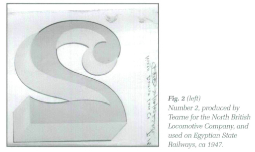 Display large image of Figure 2
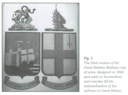 Display large image of Figure 3
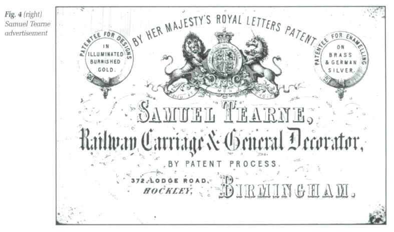
12 A British company, Tearne & Sons, was well equipped to invest in transfer production. The firm was established by Samuel Tearne in 1856 in Birmingham (Fig. 4). Located in the jewellery quarter of the city it mainly manufactured jewellery boxes. With the experience in decorative arts and interest in newest technologies the company started by producing transfers for bicycles in the 1870s and by the end of the decade was the main manufacturer of railway transfer art in Great Britain and supplied decals to many major transportation companies worldwide, as well as municipalities and counties, the Royal Household, the British Armed Forces and the Air Force. The company is still in existence and nowadays produces transfers for the famous Orient Express.6
13 The chromolithographic transfer technique used to produce most of the decals in the Silvester collection facilitated the reproduction of the multicolour decorations, lettering and numbers on any surface including glass, metal or wood, offering a less expensive alternative to hand painting and brushwork. Properly affixed transfers were highly durable; this fact made them an especially desirable form of lettering and decoration on equipment exposed to various climatic conditions, such as the rail stock running in tropical or extremely dry weather, and extensively used with limited care on long distance routes. Even though less expensive than the alternatives, the process of preparing transfers was quite complicated and required artistic skills and knowledge of printing techniques. First, the customer provided a transfer manufacturer with a master copy of an image to be reproduced. This copy usually included a detailed description of the design, size and colour dyes. The dyes were matched against a pallet of shades provided by the customer, called a colour system.7
14 The Silvester collection contains the proofs of letters and numbers prepared for the Victoria Railway Company that shed some light on this process. The master copy no. 15 was based on a design made on 14 June 1892, but actually reproduced in 1904. The Tuscan letters and numbers are outlined on the paper in ink and shaded black. The choice of colours was given as: "Black, Brown, Red, Yellow and White and Gold." Transfer manufacturers were allowed very little creative change to the master design especially in the case of the coats of arms approved by the College of Heraldry. In some cases, however, the merit of artistic expression had to be compromised with the functionality; the process of transferring imposed limitations on design and some elements of an image had to be simplified. The master copy of an image was routinely filled with instructions, signatures, and dates of approval of each change. For example, a small coat of arms prepared by Tearne for the Buenos Aires-based Lancaster Company held several handwritten inscriptions signed by A. Davis and dated between 1888 and 1891 (Fig. 5).
15 After the master image was finalized, it was given to an artist-craftsman who was responsible for reproducing it onto lithographic stones. The image was first reproduced on a "key stone" or "key plate" mat was not used for printing itself, but served as an outline, a lithographic master copy for other imprints. Next the artist made one engraving — an original plate, as it was called — for each colour used in the design and carefully examined the colours and shades used on the image in order to prepare dyes. The image from a key plate was then impressed upon lithographic stones producing as many duplicate plates as were required to print the colour image. Each area that required a different colour was drawn on a separate stone. The colour was inked in and preserved with a thin layer of gum arabic. The application of the dyes followed an order, which was the reverse of standard painting — the transparent colours first and opaque last. The colour plates were men given to a pressman, who proceeded with the process of lithographic printing.8 The first imprint, done on an inexpensive paper, was called a proof; it was inspected for errors, colours were matched against the original design, and any alternations or directions were handwritten and signed by a printer.
16 The actual printing of transfers required a high degree of skill. The image was impressed on the paper in reverse, in order to transfer it right side up on the application surface. Every stone had to be carefully aligned to complement perfectly succeeding colours, and with each added dye the face of the image was less visible to the printer, making the process very time-consuming. The parts of the design that were supposed to be filled with pure gold or silver were left empty at the printing stage and when all the other colours were ready, the coat of liquid metal was applied over the entire design.
17 The transfer paper was very sensitive to environmental changes. It expanded and shrank with even slight variations in temperature and humidity, which would make it impossible to align the colours and complete the decal. Many transfer shops were therefore equipped with environmental control units. In fact, when, in 1928, the Palm Brothers Decalcomania Company installed a climate control unit in its plant at 2726 Regent Avenue in Norwood, the plant became one of the earliest air conditioned buildings in Ohio.9
18 The preparation of the decal paper was de facto the most expensive part of the transfer making. Decal paper, classified as gummed paper, was not manufactured in mills but was prepared by transfer makers themselves or converters, also called coaters, who specialized in finish applications. One of the better-known coaters was Tullis Russell Brittains, a company that supplied paper to Tearne & Sons in England and Commercial Decal in the United States. There were two categories of the decal paper: an older type, "simplex" or "single paper," that consisted of a single layer of a heavy water-penetrable paper sheet, and newer "duplex" or "double paper" made up of a non-porous paper and a thin tissue attached to it semi-permanently. It is worth noting that the final image imprinted on both types of paper looked identical, and the two could be told apart only by carefully examining the edges of the transfer paper. The edge of the simplex was smooth, but the duplex often revealed the thin tissue separating the backings.
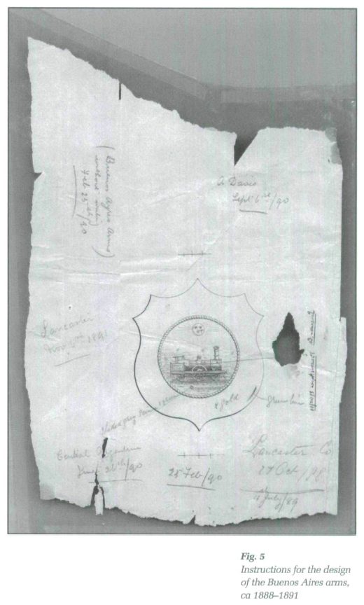 Display large image of Figure 5
19 The surface of the transfer paper was treated with three layers of coating. An undercoat was made of a starch filling evenly applied over the surface. When this coat was dry, the sheets of paper were polished between hot rollers. Then came a coat of glycerine that made the sheet pliant and prevented fractures in the starched surface. The last layer, called a transfer surface, consisted of starch, albumen and a solution of gum arabic. The sheets, stored in unvarying temperature, were allowed to season between each process for up to thirty days. These special coats allowed the image to separate easily from the paper when transferring the design onto the required surface.
20 There were five types of decals, the use of which depended on the application surface: glass or opaline glass, vitrified china, metal or wood. Glass transfers were printed on a heavy paper in transparent oil colours; the other types used metallic colours on a filmy tissue-paper. A special ink with crystalline powder had to be applied to temperature processed transfers (such as glass or porcelain), and a regular dye was used for others.10
21 Three different techniques were used to apply the above types of transfers to a surface: a pressure-sensitive process, used mostly for porcelain decoration and consequently not represented in the Silvester collection: a water-release process; and, cement mounting. The water-released decals were the most common type. These were divided into three sub-types: the water slide-off type — as implied by the name, printed right side up and slid off the paper onto a surface face up; the direct transfers, which required a light coat of varnish to be applied over the image and then placed in direct contact with the receiving surface; and finally, double-purpose transfers, usually applied on glass and read from either side.
22 The water-released direct transfers were printed on simplex paper. Originally, the entire decal was saturated before being applied to a surface. When the transfer was placed in water, the mixture of gelatine, albumen and gum arabic separated from the paper and flowed on the water. The transfer was carefully lifted, pressed on the transferring surface and left to dry. The transferred image was always coated with lacquer or varnish to enhance its durability. Since the image could easily be damaged when lifted from the water, a safer technique was developed. First, the surface the decal was to be applied to was cleaned of dust or dirt. Then the surface of the transfer was finished with a thin coat of varnish and left to dry. Just before transferring, the image was painted with another layer of varnish and the entire transfer including the backing sheet was pressed onto a surface from the centre toward the edges. When the transfer was firmly attached to the surface, the paper layer was slowly saturated with water. This process required precision to prevent the water from reaching the image layer. The soaked backing paper was then detached from the design.
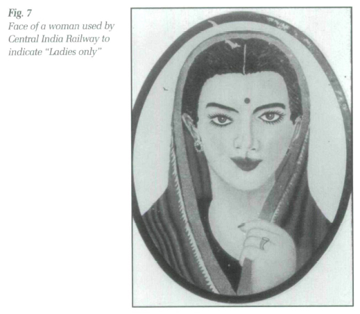
23 The water-released transfers prepared on the duplex paper required a cement mounting technique. A small area of tissue usually at the edge was first separated from the backing paper. Next, the image was coated with some decal cement applied with a soft cloth and left to set for about ten minutes (if the cement was not available a varnish could also be used). When the cement became tacky, but not thick, the decal was pressed to a clean wet surface and rolled down with a rubber roller or sponge. The wet surface prevented the decal from attaching immediately and made it easier to position the transfer. The backing paper was peeled away starting with a loose corner. The tissue paper and some gum deposit were left over the design and had to be removed with a wet sponge. If these were allowed to dry, they would crack the transfer, damaging the image. The affixed transfer was allowed to dry for up to two weeks before being washed with benzine to remove the surplus cement. The final image was protected with a coat of varnish. Over fifty percent of the transfers in the Silvester collection were made on simplex paper, considered more valuable from the collector's point of view because of its rarity. Four decals are a water slide type and the remaining were manufactured on double paper.
24 The art work, even though produced by mechanical means, strongly evokes the creative effort of its makers. Most of the transfers bear handwritten inscriptions. Notes in pencil describe the materials used, especially gold or silver leafs, and prices. Duplex paper is often, but not always, identified with a stamp and all water slides carry transferring instructions. In addition, customers' initials, date of manufacturing, a customer drawing number and sometimes the edition number are handwritten close to the image. A significant number of transfers are signed with the initials RC. Unfortunately, despite the correspondence with Tearne, it was impossible to establish the identity of this person, most probably a chief printer or a design engineer who was in charge of approving the final versions of the transfers. The company, which changed ownership ca 1968, apparently did not preserve archival documents dating back to the beginning of the twentieth century. Moreover, no pattern books for old transfers exist and in fact, when a few years ago Tearne wanted to reproduce its early decals, the company had to approach the National Railway Museum in England to borrow examples of their art work.11
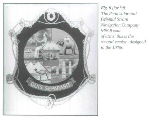
25 Artistically, the most interesting part of the collection consists of the coats of arms, ornaments, monograms and trademarks. In the nineteenth century it was customary for institutions to have a coat of arms, often armorial in character. Railway companies usually acquired a device right after their incorporation as a seal for legal documents. These rarely originated in the College of Arms. The few companies that had their arms granted by the College were Great Central and the London & North Eastern Railway, Southern Railway, the British Transport Commission and Ulster Transport Authority. Other companies often enlisted the advice of the College, but did not seek its complete approval.
26 Most railway companies assembled their arms from the devices of the towns they served, or simply placed the company's name in a garter. Many were designed by people who were not familiar with heraldic practices and laws.12 The coats of arms from the Silvester collection include arms of Barranquilla Railway & Pier Company, Blackpool Corporation Transport, Ferro Carril del Sud Buenos Aires, Central Nyanza African District Council, Cork Electric Tramways and Lighting Co. Ltd., East African Posts and Telecommunication, East Indian Railways, Egyptian State Railway, Festiniog Railways, Gold Coast Railway, Great Southern Railway, Great Western Railway, Kenya & Uganda Railway, Lagos City Council, Nizam's State Railway, North Western Railway, Norwegian State Railway, and numerous coats of arms of cities that were placed on public transportation.
27 In reproducing the devices, Tearne designers stayed very close to the original arms. Nidd Valley Railway arms provide an excellent example of the device derived from the city's official shield that could not be extensively altered (Fig. 6). The arms were based on the original Bradford arms and placed on each side tank of the Nidd Valley locomotives. The transfer produced by Tearne between 1907 and 1929 measured 12" wide by 11-1/2" high [30.5 x 29.2 cm] and depicted the arms as granted to the city ca 1907: a well on a gold chevron placed between three hunting horns. The boar's head in the crest was mounted on top of the arms. The dexter supporter was a black ram and the sinister a white angora goat, both connoting the woollen industry important to the city. The motto scroll bore a Latin inscription: "Labor Omnia Vincit" (Labour Overcomes All).13 The original coat of arms was later changed: a red and white border with eleven white roses has been added and a black ram was replaced with a stag. However, by the time these changes were implemented, the Nidd Valley Light Railway lost the competition with the local bus transport and was closed down.14 The new arms for the company were therefore never required.
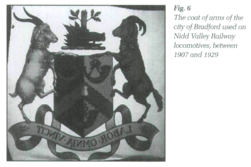 Display large image of Figure 6
28 The railway companies also devoted much attention to decorating interiors of trains, and the collection contains many examples of silver and gold interior decoration ornaments, borders, corner ornaments as well as crowns and monograms intended to enhance the first-class cars. Transfers with more elaborate designs were also produced by Tearne; the Adams style decorative ornaments, made in 1925, were placed on express trains of the South Eastern and Chatham Railway (i.e., the "Palmyra" car) and possibly on London Eastern Railway stock manufactured by the Birmingham Railway Carriage and Wagon Company.
29 The industrial transfers blended utility and aesthetics. The signs and warnings were designed in simple lettering, but were enriched by colours and shadings; some notices for colonial railways, for example, Central India Railways, were printed in three languages: English and two local dialects. Images that often replaced signs, such as a face of a woman designating "ladies only" compartments, were nothing but schematic; the elaborated design was quite detailed, with several colours used, and it was obvious that the artistic value of transfers was, in some cases, more important to railway companies than the price of decals (Fig. 7).
30 Aside from the transfers designed for railways, the collection also includes examples of images made for shipping companies as well as trademarks of businesses and manufacturers. Among the most interesting trademarks are the images designed for Pinckering Stock; Robey & Co.; P. Baker & Company Engineers; Marshall, Sons & Company; and, Huntley and Palmer to name a few. Some of these companies used a simple design that implied an association with a product, but most examples included in the collection show a heavy armorial influence that dominated Victorian times and apparently was still very popular in Britain in the first decades of the twentieth century. In 1933 Sone & Levick ordered an image of a roman chariot driven by a man and a woman; the image was covered with a heavy coat of silver. John Marston & Co. requested a galloping horse on a deep gold background (Fig. 8). Both designs, although very beautiful and artistically accomplished, revealed the skills of the Tearne's craftsmen, but at the same time show the manufacturers' preoccupation with overdrawn ornamentation.
 Display large image of Figure 7
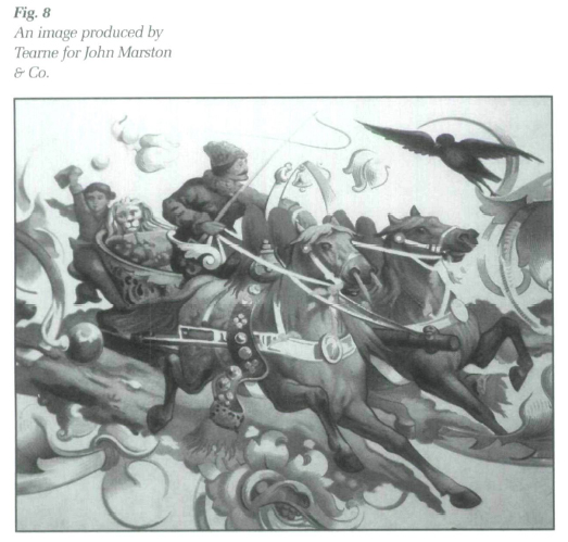
31 The extensive design, blended with overused symbolism, was also apparent in two rare examples of the coats of arms designed in the 1930s for the Peninsular and Oriental Steam Navigation Company (P&O). Two versions of the arms showed similar references to the British Empire symbolism. The earlier transfer depicted a sun over the arms that were divided into four quarters: the first quarter presented a red lion on gold background, a kangaroo in the second quarter was followed by a green dragon on brown background, and finally an elephant on a red foreground in the fourth quarter. The scroll carried an inscription: Quis nos sepambit (Who shall separate us). The second version of the arms was even more elaborate. It referred overtly to colonial motifs: the never-setting sun and Britannia ruling over the seas (Fig. 9). The blend of colours and shades must have been very hard to reproduce. Both arms were quickly abandoned because they were expensive to produce and difficult to transfer.
32 Many decals from the Silvester collection evoke interesting stories associated with the clients who ordered the art work. A good example is a simple crest produced for the S.S. Yoma in May 1928, as the ship was being built by W. Denny & Bros. The ship was owned by the British & Burmese Co. and operated as a part of the Henderson Line servicing the route from Glasgow to Rangoon. During the Second World War, the SS Yoma served as a troop-ship in the Mediterranean and was a part of the convoy when she was sunk on 17 June 1943 by a U-81 near Dema. Out of 1670 on board, 389 crew members were saved by the marines from HMAS Lismore, many of whom dived to the sea to help their colleagues. In December 1936, Tearne also produced a garter with a crest for the British Navy destroyer HMS Dainty (sunken off Tobruk on 24 February 1941). The transfer was ordered by Lieutenant Commander Cartwright, the First Lieutenant of the ship on the China Station. According to the information provided by Mr Peter J. Hillman, the Founding President of the HMS Dainty Association, this transfer does not represent an official design of the ship's crest, but is similar to images that were often placed on stationary, personal greeting cards or commercially produced memorabilia purchased by sailors.
 Display large image of Figure 9
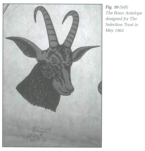 Display large image of Figure 10
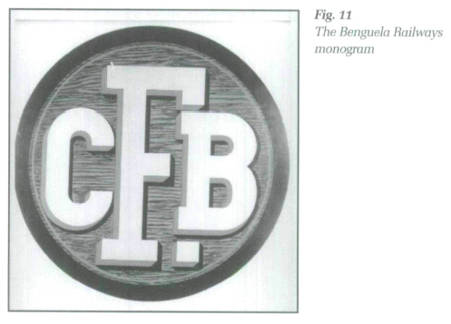
33 An image of a Roan antelope's head designed for The Selection Trust in May 1962 tells another story (Fig. 10). The Selection Trust, a U.K.-based mining company, was registered in 1914 by Sir A. C. Beatty. The company later changed its name to Roan Selection Trust and was involved in the Copperbelt excavations in Northern Rhodesia (Zambia). The head of the antelope ordered by the firm might have been adapted from the word "Roan" in the company's name; it is also possible that it alluded to the story of the origins of the Copperbelt excavations. The copper sediments were said to be discovered by William Collier while shooting a Roan antelope on the site in 1902.
34 In some cases the provenance of an image is uncertain. An elegant monogram CFB carried a handwritten note stating that the transfer was ordered by Metropolitan Cammell Carriage & Wagon Co. for railway rolling stock made for the Benguela Railways (Fig. 11). At the same time, subsequent correspondence with Mr A. Nozolino de Azevedo, Chief Mechanical Engineer of Benguela Railway, stated that the company did not use transfers but only bronze devices; he suggested that the transfer could have been an unadopted proposal or a device used by Beisa Railway. However, the Archives of the Metro-Cammell Company have no record of their dealing with the Beisa Railway; therefore, it is likely that the transfer was in fact designed for the Benguela Railway.15
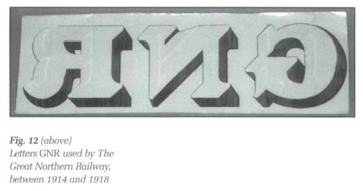
35 In other cases in-depth research on the railway liveries has helped determine when the transfers were designed. The letters GNB, preserved in the Silvester collection, were commonly used to mark the Great Northern Railway coaches and the Great Northern Railways (Ireland) coaches and wagons (Fig. 12). Incorporated in 1846, the Great Northern Railway changed the colour of its lettering making it possible to assign an approximate date to the transfer. From 1886 the letters had a gold face and red shading, in 1898 the colour of the face changed to yellow, and between 1914 and 1918 the face was white and the shading black — as in the preserved example.16 Some transfers produced by Tearne, such as the monogram TRC, depicted devices easily recognized by the expert eyes of a railway historian.17 The monogram TRC was placed on the Taltal Railway stock, a British-owned nitrate railway in Chile, registered in 1881, and built to connect the seaport of Taltal with the Atacama nitrate fields at Fefresco de Cachiyuyal and mines at Cachinal (Fig. 13).
36 Although there are similar collections, both private and public, in Great Britain, the most notable at the National Railway Museum, the Silvester collection with its emphasis on railway decals and companies' coats of arms is rather unique in the North American context. Canadian museum transfer collections are rather small and mostly consist of decals already affixed onto another object.18 Two major public collections are located in the United States. The Commercial Decal Company collection, donated to the Smithsonian Institution in 1993 by Charles Seliger, Vice-president and artist/designer for the company, is preserved at the Cooper-Hewitt National Design Museum in New York and the National Museum of American History, Archives Center in Washington.
 Display large image of Figure 12
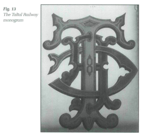
37 This company, located in Mt Vernon, New York was incorporated in 1938 and had operated for fifty-four years until, faced with problems associated with its printing processes and heavy fines for violating environmental laws, it stopped production in August 1992. The Commercial Decal Company collection is closely associated with the decorative arts, especially pottery and china ornamentation. The company produced ceramic decals using mostly the screen technique — a process of projecting an art work onto a silk, polyester or woven wire cloth screen coated with a photosensitive emulsion. It supplied companies such as Ridgewood Fine China, Haviland, Homer Laughlin, Corning and Medalta (Alberta).
38 The collection donated to the Smithsonian Institution contains thousands of sample decals arranged alphabetically by client and pattern name and complemented by production records including pressroom jackets, colour and formula silk-screen worksheet, special notes or remarks and finally proofs of each colour. The pressroom jacket lists the customer, pattern name, edition, type of process and paper, size and quantity. The secret of beautiful ceramic decals lay in the specific mixture of inorganic colour oxides, which had to melt during the firing process at just the right moment, which was determined by the fusing temperature of the substratum, be it china, glass or earthenware. The silk-screen worksheet details the formulas for mixing pigments to achieve the desired colours. The firing of each colour block was carefully examined and matched to the art work, and the Commercial Decal collection contains numerous examples of colour samples and printings that were produced prior to the final version of the decal.
39 The other large collection of transfers preserved in North America consists of the archival documents of the Palm Brothers Decalcomania Company, the oldest American transfer producer, first incorporated in 1868. It is kept at the Cincinnati Museum Center. This very rich collection —16 cubic feet of records — contains correspondence, business and financial statements, sample decals as well as information on the company's customers and the competition. The Palm Brothers produced decorative decals for a vast range of manufacturers: Ford Motor Company, The Edison Phonograph Co., The John Deer Plow Company, The Columbia Wagon Co., and The American Wringer Company. Canadian customers included McLaughlin Carriage Co., Oshawa, Ontario; Burrow, Stewart & Milne, Hamilton, Ontario; Canada Carriage Co., Brockville, Ontario; Clare Bros, Winnipeg; Frost & Wood, Smith Falls, Ontario; Lakefield Canoe Building and Manufacturing Co., Lakefield, Ontario, to name a few. Since Palm Brothers provided free design services to their clients, the collection also includes interesting records of the creation and approval processes.19
40 Both American collections complement the art work with a selection of annual reports, photographs, letters and articles that enrich our understanding of decal manufacturing and the general operations of the transfer companies. Unfortunately, similar material has not been located for the Tearne & Sons Company. Nonetheless, in the context of the study of the history of industrial arts and graphic design as an expression of the corporate identity, the Silvester collection remains a rare and important resource.
The author is very grateful to Mr David Wright from the National Railway Museum in England for his invaluable help in documenting the Silvester collection. I would also like to thank Mr Geoff Rider from the Canada Science and Technology Museum for his support and suggestions during the research, and Mrs Maggie Yax, Manager of the Archives and Manuscripts Division of the Cincinnati Museum Center as well as the staff of the Smithsonian Institution NMAH Archives Center in Washington, D.C., for their help in conducting this study.