Articles
Seeing is Believing?
A Critique of Archival Visual Sources for Material Culture Research
1 Can you, as a material culture researcher, trust the image you see in the archives — a painting, a print, a photo, a poster, a map? How far is it truthful? How can it deceive you?
2 For our purposes we can divide images into two sorts, those that were originally hand-produced, such as paintings, prints, or maps, and those that were produced by a machine, such as photographs.
3 The quality of a hand-produced work is determined by three factors: the producer's knowledge of his subject, his skill in reproducing his knowledge on a two-dimensional surface so that it may easily be "read" and understood by the viewer, and his intent, or the reason behind the production of the image. An illustration of the importance of the first factor is P. Desceliers's map of 1546 showing Cartier's exploration of North America. We do not at first recognize the land formations at all; it is only when we turn the map upside down that we realize Desceliers has drawn it from the viewpoint of a European approaching an unknown continent from the north, so that Florida appears at the top left rather than, as we are conditioned to seeing it, at the bottom right. Having learned to read the mapmaker's "language," we then see that he has been able to include only the eastern seaboard of the continent and the St. Lawrence River as these were the only parts he knew about; furthermore, he has included illustrations of imaginary flora and fauna. Although this is an exaggerated example, every map, even those produced today, has some distortion, due to lack of knowledge and selectivity on the part of the mapmaker and to the nature of a map as an abstraction of reality.
4 The mapmaker presumes a certain knowledgeability on the part of the viewer regarding the rules of reproduction, and we must learn these rules in order to understand his map. This applies as much to other forms of visual imagery as it does to maps, although this is less often recognized. J.P. Cockburn's drawing of the jail on St. Stanislaus Street in Quebec, done about 1830, shows through his handling of perspective that he presumed his audience was familiar with the language of classical architecture. Although the pediment on the jail projects at a peculiar angle, seeming to bend over the street, we are to understand that, like all other classically designed buildings, it sits upright and frontally on the façade. However, the artist did not have the skill to reproduce the actual perspective accurately. This also serves as an example of the important role played by the producer's skill in reproducing his knowledge about the three-dimensional world onto a two-dimensional surface — the second factor determining the quality of hand-produced work.
5 The third factor, the producer's intent or the reason behind the production of the image, affects what he leaves in, what he takes out, and how he treats what he leaves in. Very seldom is the producer's aim educational, even when it is ostensibly so. The image will usually have an even more important ulterior purpose so we must always approach it sceptically. What could some of these purposes be? Most obviously, they could be artistic, that is, within the conventions of the art world of the day. In nineteenth-century Canada, for example, these would include concepts such as the Sublime, the Picturesque, or the Romantic, all well-defined attitudes toward the reproduction of the exterior world, each with a circumscribed iconography and style. An example of the Sublime is H.J. Warre's Falls of the Palouse River (1846) where the immensity of the natural rock formations is exploited, even exaggerated, by the contrast of scale with the tiny explorers. On the other hand the intimacy and variety of the Picturesque is expressed by J. Duncan in his painting of the falls near Lake St. John, Quebec (fig. 1). Note in particular the zig-zag composition and the fallen, barren tree trunks.
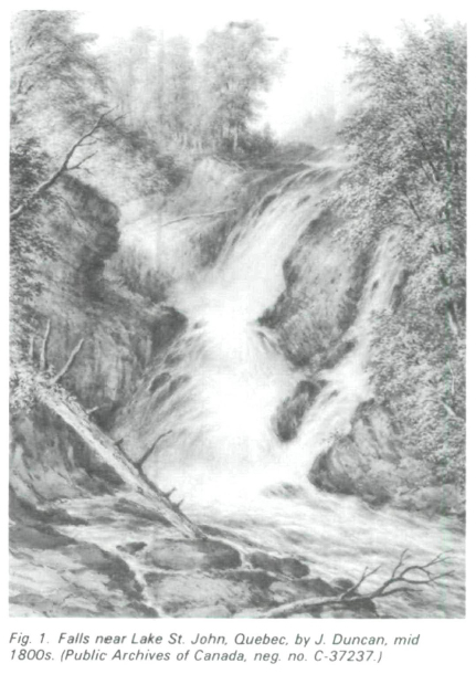 Display large image of Figure 1
6 Finally, romanticization of a subject is patent in A.J. Miller's portrait of Schim-A-Co-Che or High Lance, a Crow Indian whose costume, bearing, and facial features all bespeak the Noble Savage (fig. 2).
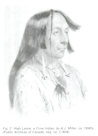 Display large image of Figure 2
7 Commercial intent is another prevalent reason for the production of images; the maker wishes to sell to tourists or to a specific art-buying public and so accords his images with the convictions and viewpoints of his audience. Cornelius Krieghoff's habitant scenes, in their picturesque and somewhat patronizing portrayal of French-Canadian life during the mid nineteenth century, were popularly bought as souvenirs by the English stationed in Quebec and not often by the inhabitants of the area.
8 The producer's intent could also be caricatural, humorous, or entertaining, either for himself or for his public. H.J. Warre's 1842 sketches of a moose hunt on the St. Maurice contrast in comic juxtaposition the rigours of sleighing in the country with sleighing in Montreal. Or the producer's intent could be propagandistic; exhortative posters from the First World War make this point dramatically (fig. 3). The producer's intent could, in fact, be any combination of the preceding; but very seldom did he simply record a scene or an event factually and exactly, with no other message or convention to distort his choices or his treatment of his choices.
9 The machine-produced work — the photograph — is not as different from the hand-produced work as prejudice might suggest. It can remove the inaccuracy of only one of these three factors, that associated with knowledge of the subject. Detailed knowledge of the subject is not as crucial for an accurate rendering when reproducing by camera compared to reproducing by hand. In fact, the photograph can substantially increase the "knowledge" content of a scene, whether that is intended by the producer or not. F.W. Micklethwaite's street scenes in Toronto at the turn of the century, intended to give a panoramic view of several city blocks, reveal under magnification an incredible wealth of detail in architecture, costume, merchandise, social interrelationships, fashions of all sorts, the advance of mechanization, and the spread of electrical and transportation technologies. Every photograph is capable of this kind of detail, captured willy-nilly unless suppressive manipulation has occurred. (With hand-produced works, of course, nothing can be seen that was not put in originally by the producer.) But this virtue is also a drawback because photographs cannot generalize or speak abstractly. What you gain in greater specificity, you lose in the ability to see the wider context, the "big picture." To make the photographic equivalent of a map, you have to correlate hundreds and thousands of images, each one limited in what it can tell you. Government survey departments do this now with the ultimate aim of producing a supremely accurate map. Photographic panoramas, high viewpoints, and serial views are all attempts to combine the virtue of the photograph with the virtue of the map.
 Display large image of Figure 3
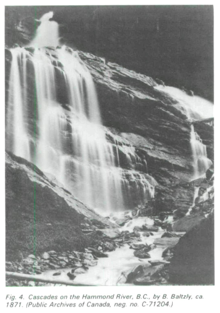 Display large image of Figure 4
10 Regarding the other two factors, skill and intent, as they affect photography, the same amount of manipulation prevails as in hand-produced work. Skill can determine the quality of the image, both in creating a poor, distorted image and in creating an image that seems truthful but is in fact ideal. This goes beyond airbrushing and touch-ups. Returning to F.W. Micklethwaite's buildings in Toronto, for example, often the photographer's skill with a large view camera and its adjustable back has been used to minimize or entirely negate the visual effect of parallax in a large structure. We see an ideal view of the building, not the one of the spectator in the street, whose impression of the building when looking up from below will be powerfully affected by the apparent tendency of the vertical lines to lean toward each other with height. This impression, one taken into account and indeed often desired by the architect, will be wiped out by the photographer who approaches the structure as though trying to render an architect's elevation. He chooses a moment when lighting is as shadowless as possible, and when the detail can be rendered accurately; he shows us the proportions as geometrically correct in their interrelationships, but not as they impress themselves on the senses of the viewer in the street.
11 However, photographic manipulation occurs most obviously in the third factor. Intent can distort or otherwise affect both our and the photographer's knowledge of his subject and his use of his manipulative skill. Here we may place posing (the remarks above related to unposed subjects) and the choice of viewpoint as determinants. Pose and viewpoint in photographs continue the conventions of other picture-making modes and for the same reasons. Artistic conventions are adhered to in the Sublime landscape of Notman & Son's view of the Bow River in Alberta, with its exploitation of immense scale; Benjamin Baltzly's Cascades on the Hammond River (fig. 4) is the photographic equivalent of Duncan's Picturesque landscape, from the zig-zag composition to the fallen tree trunk. And Notman's portrait of Chief Sitting Bull (fig. 5) reveals its Romantic outlook when compared to an Indian in Abitibi, Ontario, in 1906 (fig. 6). The differences in costume, background, and pose are not factors of the different dates, but of the photographers' attitudes. ES. Curtis was producing Indian portraits as powerfully Romantic as Notman, even providing costumes, as late as the early 1900s.
 Display large image of Figure 5
12 Commercial purposes determine the form of many other photographs. Using Notman again as an example we can recall his popular series of hunting scenes, all stage-managed in his studio and intended, like the majority of landscape views, to be sold as souvenirs of Canada. Caricature, humour, entertainment, and propaganda are all wrapped up in a series of postcards from ca. 1910 which show giant vegetables as typical Canadian crops — "Our cucumbers grow big" may be tongue in cheek, but its message is seriously intended to produce maximum effect.
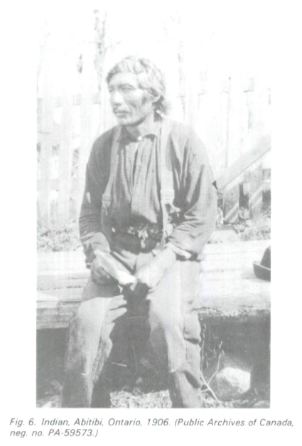 Display large image of Figure 6
13 How does what we have noted about knowledge of subject, skill in the production of the image, and intent of the producer apply to a specific example from museum or artifact research? Let us assume that, as museum researcher, you have a group of what you believe are First World War artifacts, and you want to verify their identification and dates and eventually create a display or write an article about them. Where can you find information in primary visual archival sources and what pitfalls must you watch out for?
14 One source we have already mentioned, posters, often displays details of costume and equipment (fig. 3). But how might their exhortative intent affect the accuracy of the information? This would vary widely depending on the original source of the image; some are so close to illustrations of soldiers in field exercise manuals that a substantial degree of accuracy in detail may be assumed; others are of course simplified for the sake of powerful visual effect. Training manuals, dress regulations, and handbooks all often provide engravings that do more than merely illustrate the written text; they are an integral part of the explanations. The Handbook of the German Army from 19111 provides both "realistic" costume views as worn by the men and stylized views (fig. 7). It is the map-like, stylized views that provide most clear detail, but the realistic views that place the uniforms in context. Surplus military and camping equipment catalogues for mail order houses, such as those of Francis Bannerman in New York (Catalogue of Military Goods for Sale) or of Adolph Frank in Hamburg (Arms of the World — 1911).y provide examples of visual images that have overriding informational intent coupled with their primary purpose as advertising.
 Display large image of Figure 7
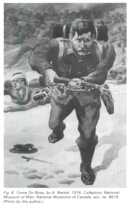
15 War art of any "finished" quality, as opposed to rapid, on-the-spot sketches, must be approached gingerly. A. Nantel produced the work in figure 8 to pass the time in a prisoner of war camp in 1916. It was intended to represent a soldier of 1915, surely fresh in his memory. In fact, it contains a number of errors of detail, such as the blue epaulettes on the shoulders, a characteristic datable to 1907, not 1915. An error in foreshortening gives the impression of a short, slim bayonet, not the long, flat, sword-like one prevalent at the time.
16 War photography may be equally unreliable. William Ivor Castle, the Official Canadian Photographer from mid 1916, produced a series of "Over the Top" views of Canadians engaged in trench warfare at the Battle of the Somme which became famous through a touring exhibition sponsored by the Canadian government. Castle himself insisted in print on their accuracy as photographs taken during actual combat. In fact they were set-up shots taken during training manoeuvres at St. Pol, France, as the breech covers on the rifles confirm (fig. 9). No soldier would have entered active combat with his weapon rendered ineffective in this way. Other scenes show officers with cloth caps, instead of the regulation steel helmets; the shellbursts in the sky were printed in for greater "realism" as were dead German bodies in other scenes.2
17 Conventions of sublime glorification and pictorialism could also be easily applied to war photography without crossing the line into actual fraud. About 1916 or 1917 the Russell Motor Car Company produced a report on the firm's adaptation to munitions production. In particular it detailed in text and photographs the construction of a 9.2 howitzer shell. In all the photographs rather heavy-handed touching up has outlined the shells in white, providing them with a kind of shimmering halo, while the operators and men at the machines fade into almost indistinguishable grey tones next to them. The shell that looks about three feet long in the machine room expands in size in the packing room till it equals the size of the men. This is achieved not only through the outlining technique but also through foreshortened viewpoint, where the shells are placed close to the spectator and the men are set in the middle distance. The effect is unmistakably intended to glorify the howitzer shells and the company that produced them. Figures 10 and 11 both show hydraulic presses used in the munitions industries of the First World War. "Big Chief" (fig. 10) has been touched up in the same way as the Russel Motor Car Company pictures, with white outlining to emphasize the shining machinery and powerful foreshortening in the foreground. Yet it is an illustration to a history book, David Carnegie's History of Munitions Supply in Canada, a lesson that objectivity is no more likely to reside in secondary sources than in primary ones. Figure 10 forms an instructive comparison with figure 5; both share the title of "Big Chief" and both are informed by a remarkably similar attitude of romanticization which concentrates on their power.
 Display large image of Figure 8
 Display large image of Figure 9
 Display large image of Figure 10
18 Finally, figure 11 exhibits another convention derived from the artistic world but one which was a peculiar adaptation of photography. This is the convention of pictorialism, or the deliberate infusion of art standards of composition, design, and technique into the photographic image. Pursuing this aim, all distracting and "unartistic" detail is suppressed, both through the use of soft focus and through darkroom manipulation during printing. The image continues to glorify the satanic power of the machine, with its surrounding heroic workers, but contains less information than figure 10 and more art.
 Display large image of Figure 11
19 In examining all these sources for our First World War museum project, we see how easily we could have been led astray if we had held the common prejudice that certain sources, such as photographs, are intrinsically more accurate than other sources, such as drawings. But the problem is more subtle even than this, and discounting a source because it contains a flaw will leave us with very few sources indeed. Images may be wrong in one way and right in another. Ivor Castle may have been wrong in his details, but he was right in his atmosphere of trench warfare. He may not have photographed the Somme, but he was at other battles and familiar with action in war. Some posters may be accurate and correct in costume detail, but their simple designs, often symmetrical and symbolic (see fig. 3), give an entirely misleading impression of an orderly, clean, and prepared war.
20 Faced with such a plethora of pitfalls, how do we get a balanced, unbiased "picture" of the importance, use, or history of our objects, be they from the First World War or any other period? The only really useful way is by comparing our images in series, as has been done throughout this discussion. Never rely on only one source of pictures, or only one picture. Doing so is the sure way to misrepresentation. Of course your judgment must always be supplemented by a knowledge of the subject gained from other sources, and these should include not only secondary written sources but also consultations with others more expert in the field.
21 This paper has concentrated on the difficulties involved in using visual images as a source of historical knowledge about objects. Although these sources are very rich, they require the same close scrutiny and interpretation given to manuscript sources. They reveal the same selectivity and conventions of thought, ideals, and prejudices that are found in any other original archival resource. You treat them as mere illustrations at your peril.