Reviews / Comptes rendus
"Milltown Gallery"
1 Any commentary on this new exhibit should first note that it has been a long time in the making and has had to contend with problems of location, changes in personnel and periodic starvation of funds. That being recognized, one can state that in spite of some flaws the Milltown Gallery is quite an achievement in interpretation and probably the best effort yet by Vancouver's handsome new museum. Some of the thinking is similar to that found in the history displays at the British Columbia Provincial Museum in Victoria, but "Milltown" is less impressionistic and therefore more intelligible.
2 The gallery deals — as its name suggests — with the early years of Vancouver, picking up from a preceding gallery on "Exploration and Settlement." It is broken down into four roughly equal sections which deal with logging, the village of Gastown -Granville, the arrival of the Canadian Pacific Railway and the birth of the city. There is a clearly defined chronological flow plan from one area to another, although within the sections the material is handled in independent units, each one devoted to a particular subject.
3 Overall balance in the material is excellent. The planners recognized clearly the complexity and variety of any historical period and cover a considerable number of topics, including politics, economics, churches, schools, entertainment, journalism, etc., both in broad terms and in detail. The gallery will thus appeal to a wide range of tastes and interests. The selection of objects on display is also well chosen to illustrate the period and again shows a nice variety: from heavy industrial equipment to personal letters, from the solemnity of the minister's Bible to the conviviality of tavern dice and bottles.
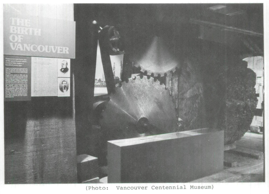
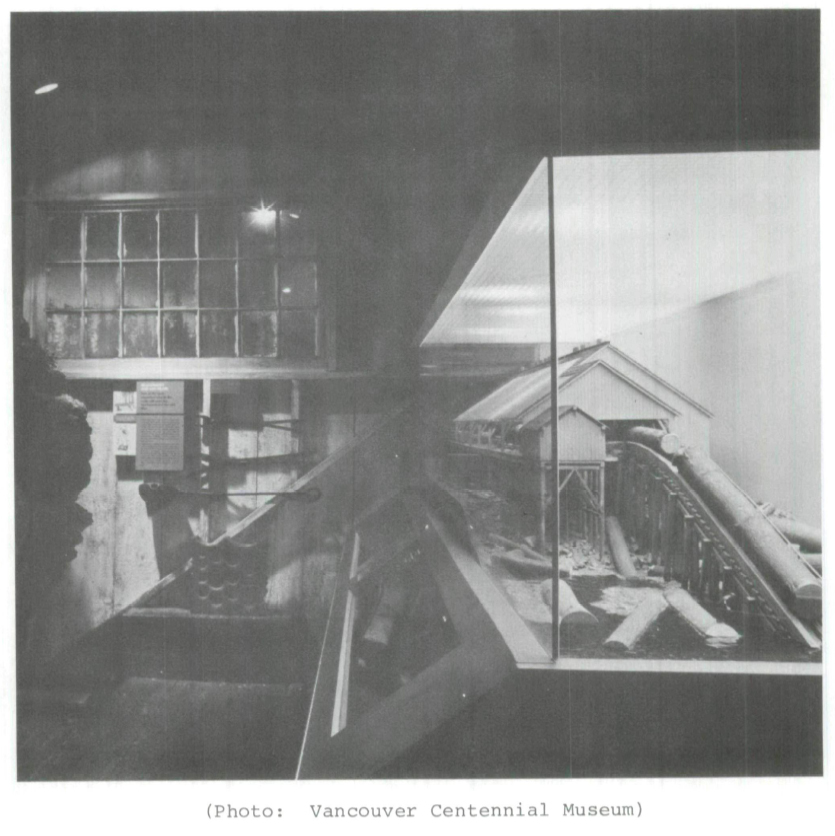
4 The selection of interpretive devices is also varied and well balanced. Good use is made of photo murals and excellent use made of textures and touchable objects. One of the most successful devices is a corridor of huge logs, the blades that sawed them nearby, with cut lumber superimposed on one side to bring out vividly the productivity of the virgin forest. Another device is a re-created C.P.R. colonists' car in which the visitor can sit and imagine an 1886 train ride. A considerable contribution is also made by two models, one of a sawmill, the other a large topographical model of Burrard Inlet which is very effective in showing the tiny scratches made by man on the landscape of 1881.
5 Messages are conveyed to the visitor by the printed word. A three-tier system is used. A large headline outlines the subject, is expanded upon in a brief main text and extra detail is given in a longer text using smaller type. The visitor is thus left free to read as much as he wishes. A fourth type size is used for labelling objects. Generally speaking the copy is easily read and not excessive. There are no audio-visual units although a pleasing touch is a recording of Victorian melodies from a musical box.
6 The overall design of the exhibits is very good. One can move easily from section to section. The balance of the layout is also very good. The eye is guided subtly from effect to effect, from large open areas to ones of detail and close concentration. There is plentiful "white space" to rest in, and seats for the weary. Excellent use is also made of the height of the gallery. The floor and ceiling levels vary and one has a strong impression of having been somewhere after leaving the exhibit. Several "monumental" artifacts such, as large saw blades, a Red Ensign and a printing press are particularly well used. They stand out individually yet add to the overall impression.
7 Most visitors will probably enjoy the gallery and not ever notice any faults. The following comments are intended for museum professionals; I hope they will be seen as constructive criticism, not carping.
8 My main objection to the gallery is a very basic one: how practical is it? i.e., is it a sound economic proposition, and does it allow for change and/or growth. The answer to these questions is negative.
9 The cost of the project has obviously been immense. It is entirely custom-made and many of the display vehicles are tailored for one spot and one spot only. It is thus very inflexible: with minor exceptions there is very little room for rotating displays, new material or second thoughts. Typical is the railroad car. Instead of finding an old one in some railroad roundhouse and chopping off the needed length, the Centennial actually reconstructed what it wanted. I have been told the cost was $25,000 which, if true, is quite a sum for a one-purpose, one-shot unit, which could probably have been picked up for nothing. (And I have seen such cars in several places; I know they exist.) Worse than the expense is the fact that the car is not even particularly realistic: it has papier-mâché wheels, for instance, which do not look right and sound silly when people tap them — as people do.
10 The questions are fundamental. How many years will an exhibit last? Should it be static or should it grow and change? Should an essentially outdoor thing — a railroad car — be reconstructed indoors? Should one attempt to re-create reality at vast expense — as in the Provincial Museum of Victoria or here — or should one simulate or suggest reality at relatively low cost? How important is a display vehicle? Should a museum concentrate on objects or spend all its money on interpretive exhibits? The Centennial has taken a very expensive, inflexible step, however beautiful the results.
11 My remaining criticisms are minor. The theme colour — a kind of lumber brown — becomes rather monotonous and in some cases is not very appropriate, for example, where it is background to a pink fireplace setting, and where brown type is printed on it, sometimes against a brown background. The lighting is generally good but there are some hot spots and a few places where a tall person can get his neck almost burned by spotlights.
12 Some of the artifacts on display repeat material shown in the galleries on either side and thus lose some of their uniqueness. One prize artifact is also rather poorly displayed — Gassy Jack's trunk. It is unlit and has an almost invisible label. On my first time through I missed it completely. Old Deighton actually gets rather a poor deal. He did after all give his name to a singular part of Vancouver's history, but in"Milltown" he is rather lumped in with everybody else. With the development of Gastown as a tourist attraction more attention to its "founder" would have been appropriate. Another mistake in the same area is the obscuring of a fine photo mural by superimposed artifacts and pictures (although the artifacts themselves are most interesting and apropos).
13 The style of the texts is perhaps a little stiff. A few more quotations would have added flavor, although there are plenty of original newsclippings.
14 The day I was there it was extremely hot; I hope this is not a permanent feature. The music also got a little tedious; a push button might be preferable — one tune at a time.
15 The model of Hastings Mill is a mite disappointing. Its plain white background does not enhance it; the labelling is difficult to follow and I could not help feeling the whole thing was back to front. Sound effects might help if funds become available.
16 Among some smaller details, I noticed a catalogue number very visible on a saw, strapping rather obviously holding tree and bark together (no epoxy?), a possessive apostrophe missing in the first line of a prominent text, and a photo mural that had two panels mounted out of line with the others: surely easy enough to rectify?
17 However, let not this list of criticisms detract from my general appraisal — that"Milltown" is a success and a credit to its developers. I look forward to hearing their impressions of the B.C. Sugar Museum which will open in January 1977.
Curator
B.C. Sugar Museum
Vancouver, B.C.

